I have an interesting history with Lansdowne Shopping Centre. I first worked on the account back in the early 90's, when I was founder and partner of the Thumbnail Creative Group. The mall was cavernous and virtually empty when we visited on a sunny Tuesday afternoon. At that time it was called Lansdowne Park Shopping Centre as it was build on the old racetrack site. It is also situated between two very established large shopping centres which have the lion's share of the market. With it's tenant mix and huge parking lot it was, and still is, a handy mall for families to find what they need. So with a family market in mind and lots of room for strollers, I came up with the tag line "shopping is a breeze in the Park". It was a great campaign (email me if you want to see more), and it garnered Ivanhoe Cambridge their first gold Maxi award for excellence in shopping centre marketing. Eventually, management changed and we were asked to market the centre as a fashion centre. As they did not have the tenants to support this, we advised against it. In the end, we resigned the account.
Fast forward to 2010 and I am once again branding the centre. Only they have lost the "park" and are now called simply Lansdowne Centre. They are still hemmed in by two larger malls.
The majority of the population of Richmond is Chinese, so the primary challenge was to create a strong, easily identifiable, visual brand for Lansdowne Centre that would resonate with both western and eastern consumers. So I set out to create a campaign that would allow the centre to get its message across to its target audience no matter what language. The campaign I developed is unique, cost effective, and not only crosses the language and cultural boundaries but also creates an appealing and approachable persona for the centre.
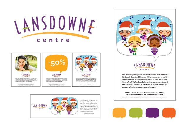
Because the mall is comprised of an eclectic mix of shops and services I came up with the tag line " Lansdowne Centre: unique stores, great people."
Much like the old adage that a photo says 1000 words Lansdowne now has the ability to “speak” to consumers through pictures. The logo underwent slight modifications to update it while enabling the centre to avoid costly changes to signage and the new colours formed the pallet for type only ads.
Rather than do a wholesale change that would require costly updates to pylon signage, I updated the type and colours of the logo while maintaining the overall integrity of the original design.

Ads are designed to facilitate quick and easy updates and changes. The speech bubble is the central focus and leads the viewer directly to the logo for brand recognition. Images can be photos or illustrations. When necessary type only ads can be run using few words reversed out of the standardized colour palette which matches the logo.

Outdoor is an important component of the campaign. Ads ran on TSAs, billboards, Skytrain posters and interior transit cards.